
TICKLED PINK
SUGARHOUSE REBRAND AND MARKETING
Branding/design/copy/marketing/social/web ads
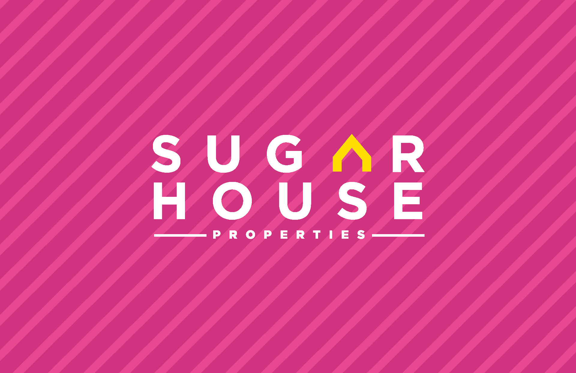
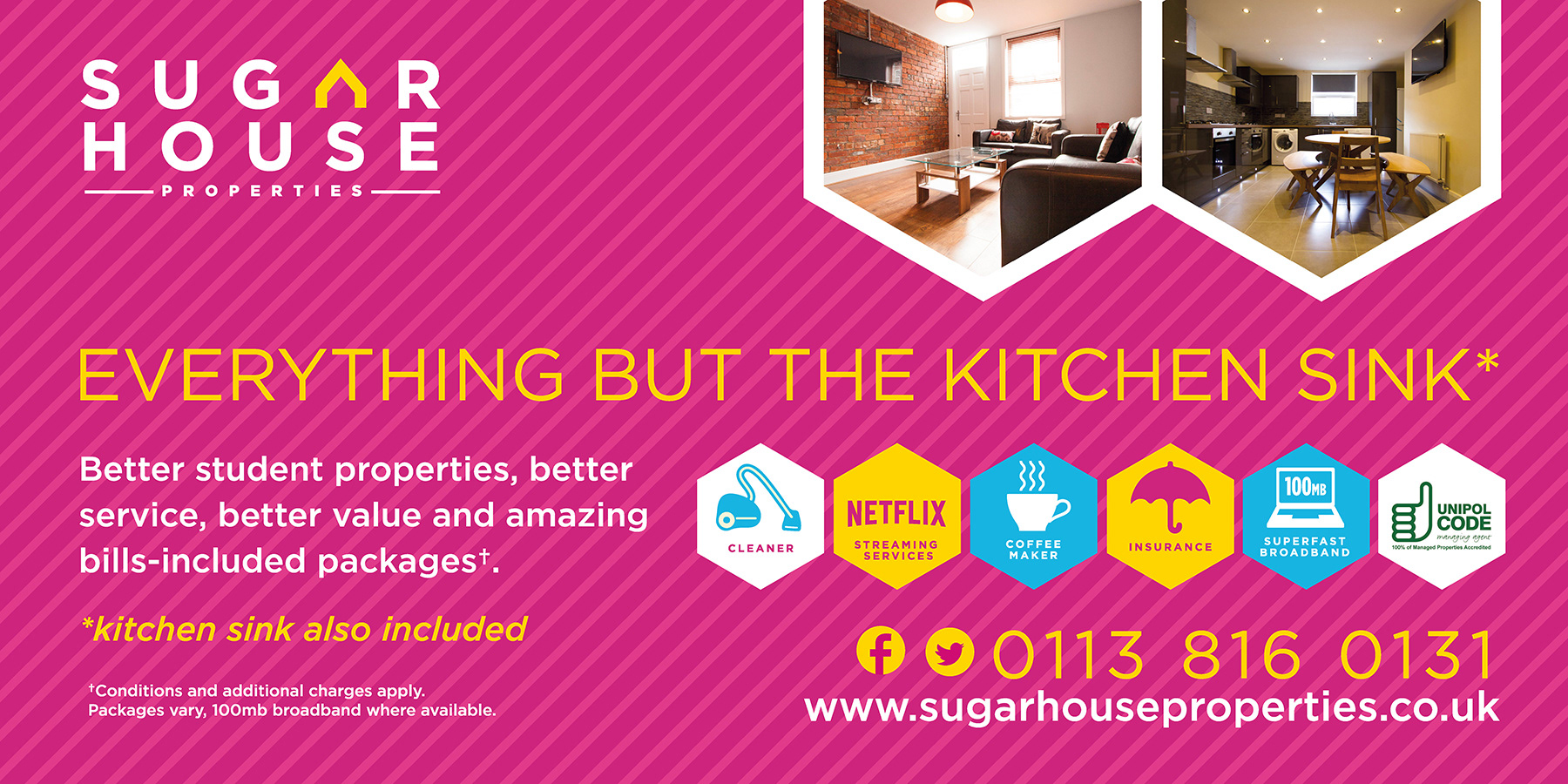
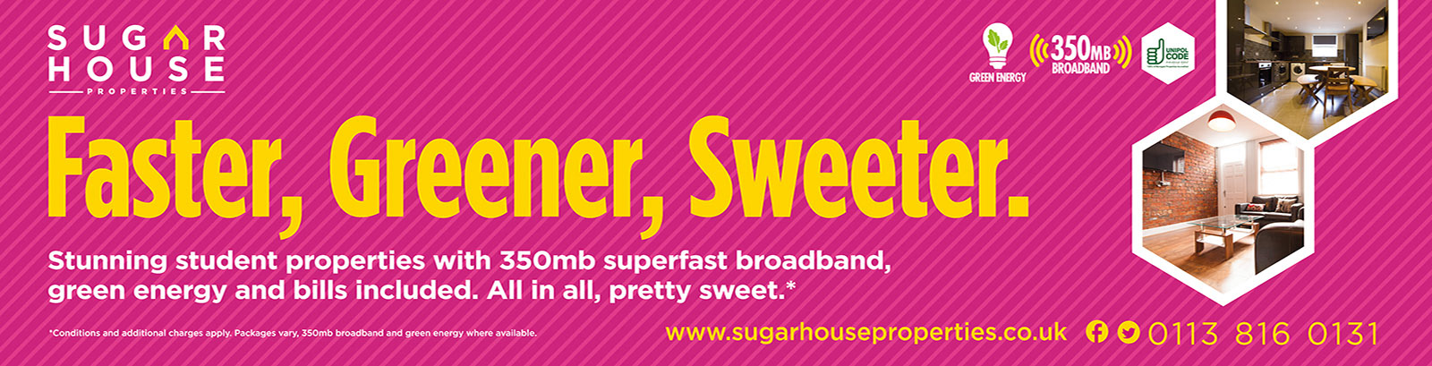
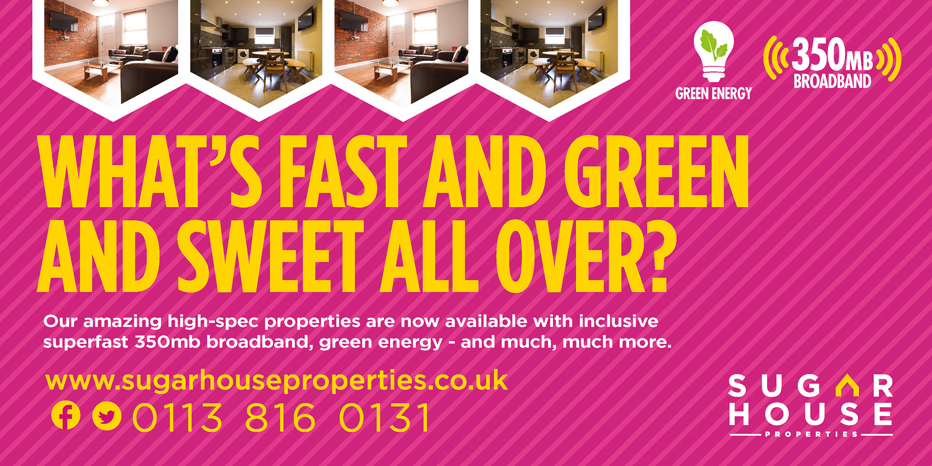
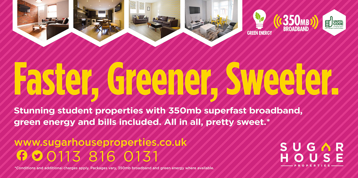
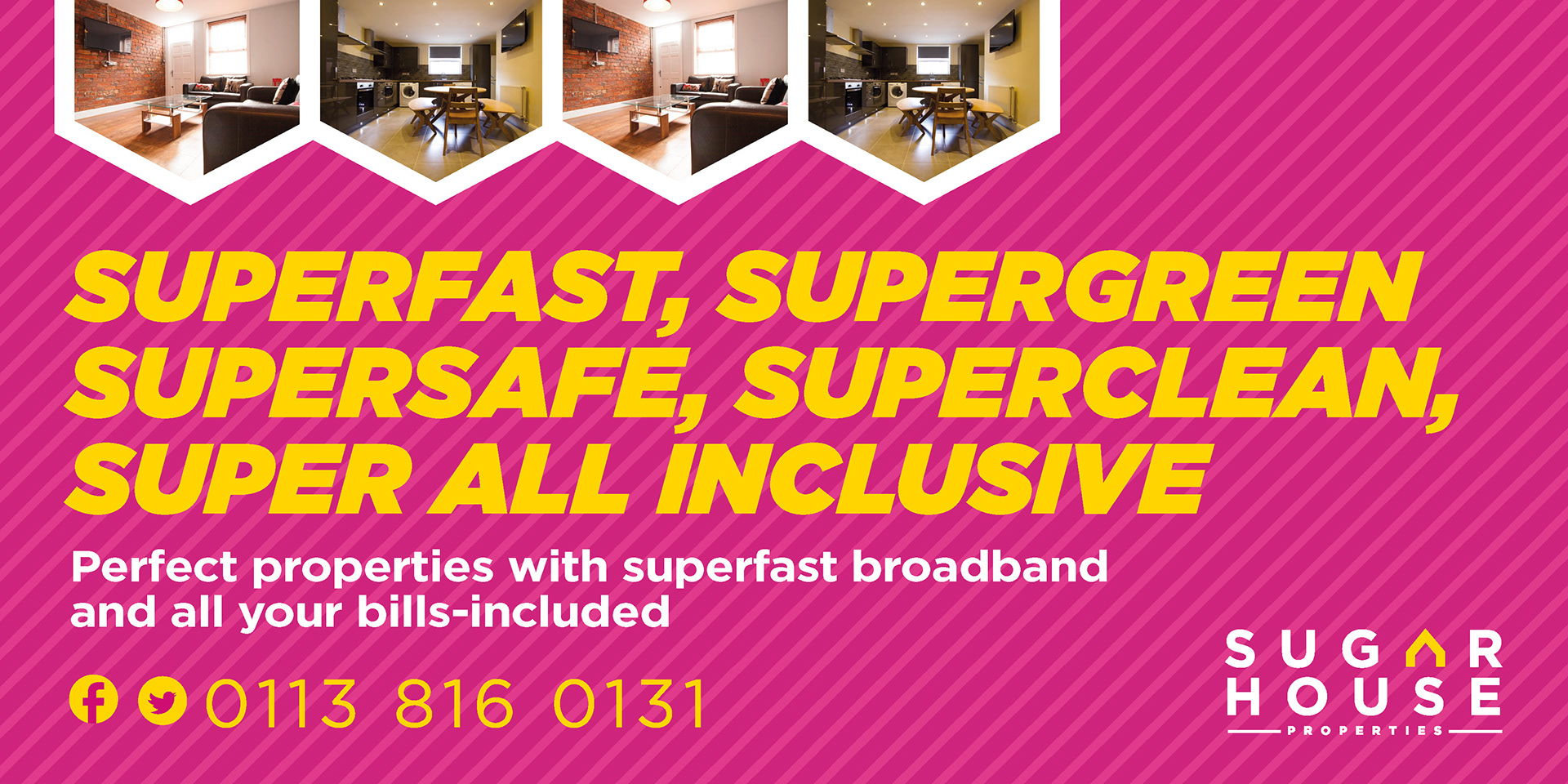
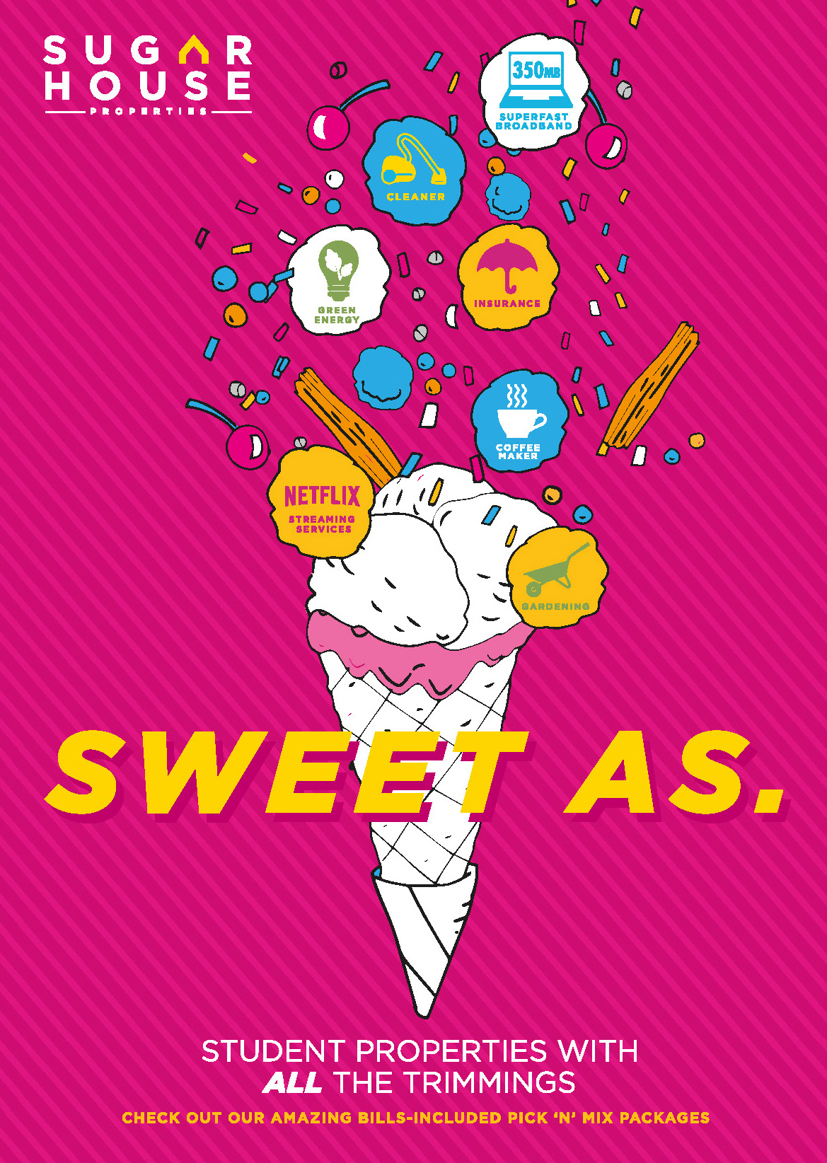
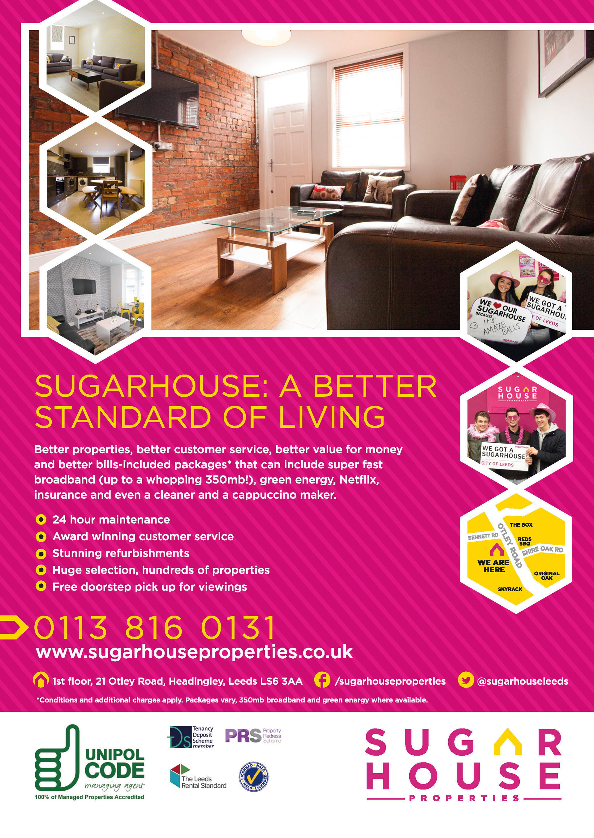
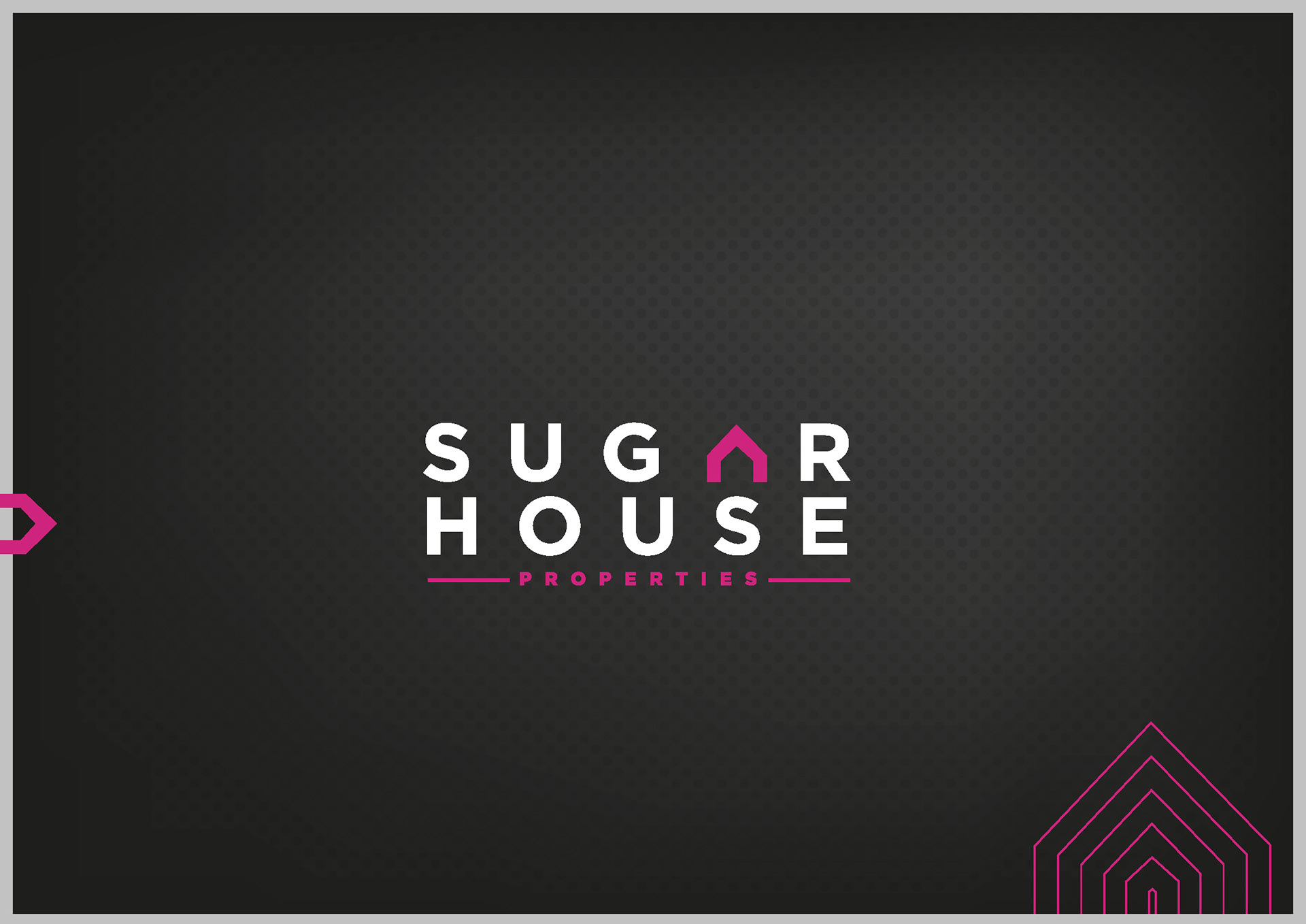
Sugarhouse, a local property management company, wanted a brand refresh - along with new marketing materials.
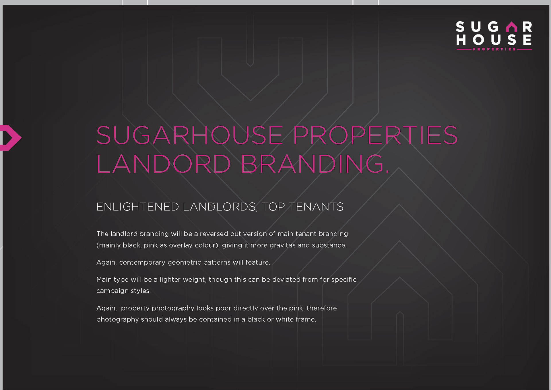
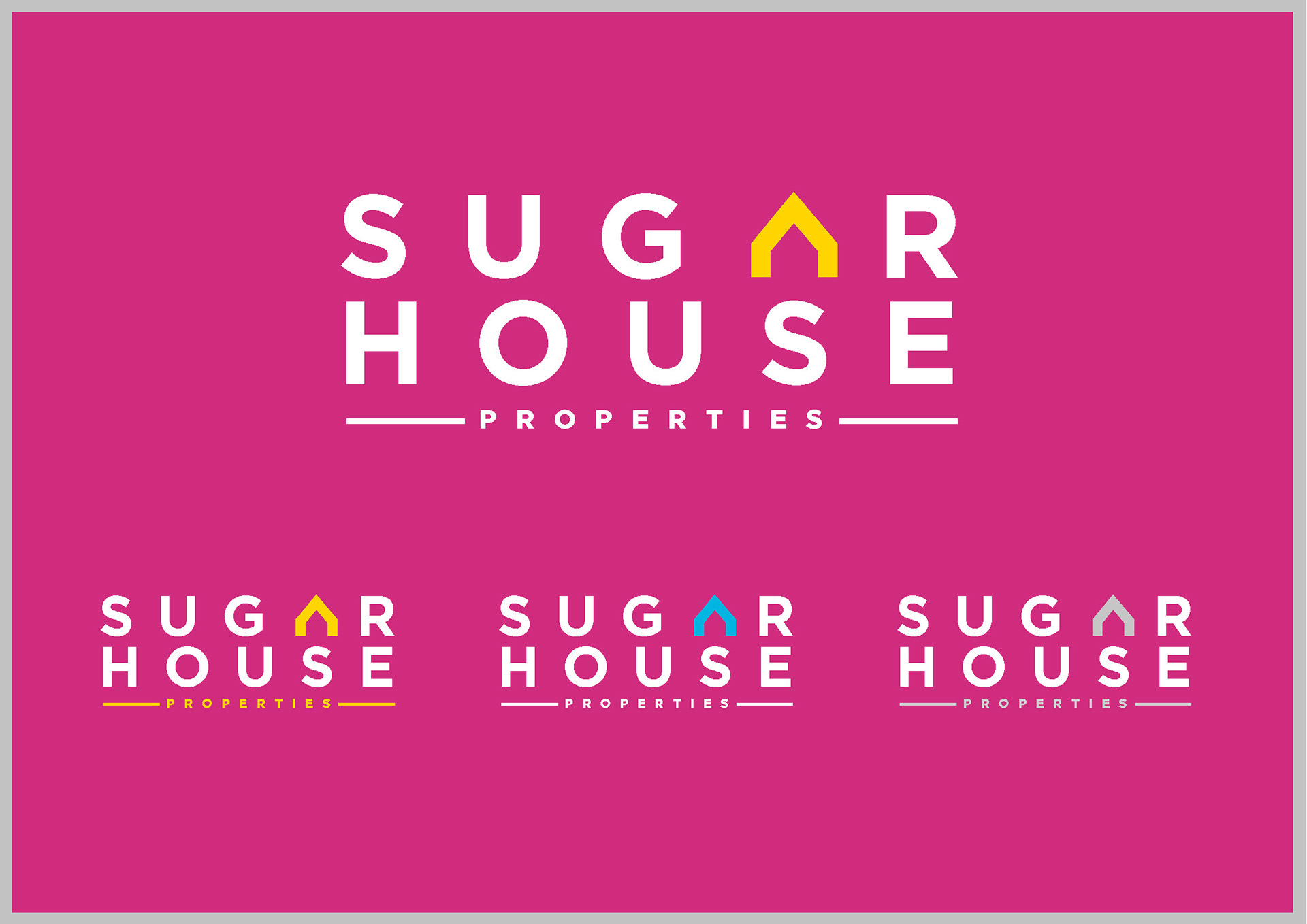
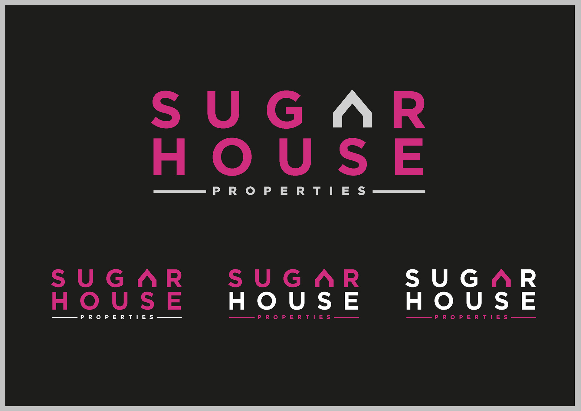
Two sub-brands were needed - one for tenants (primarily students/young professionals), and a more conservative version for landlords.
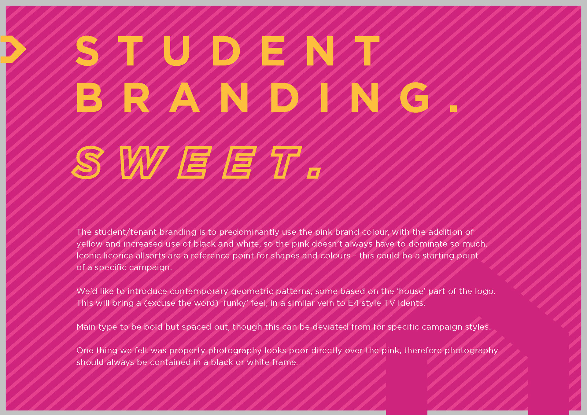
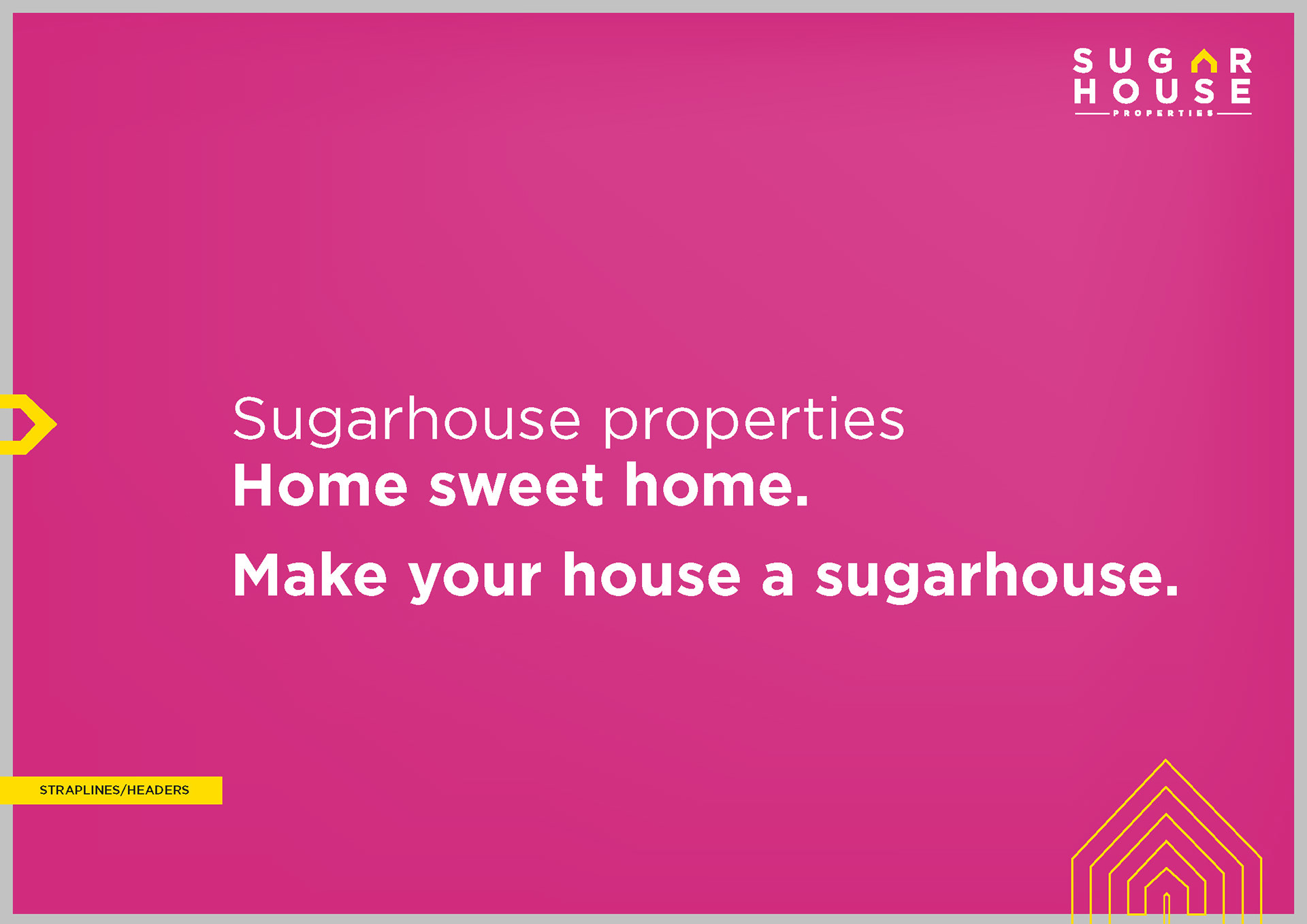
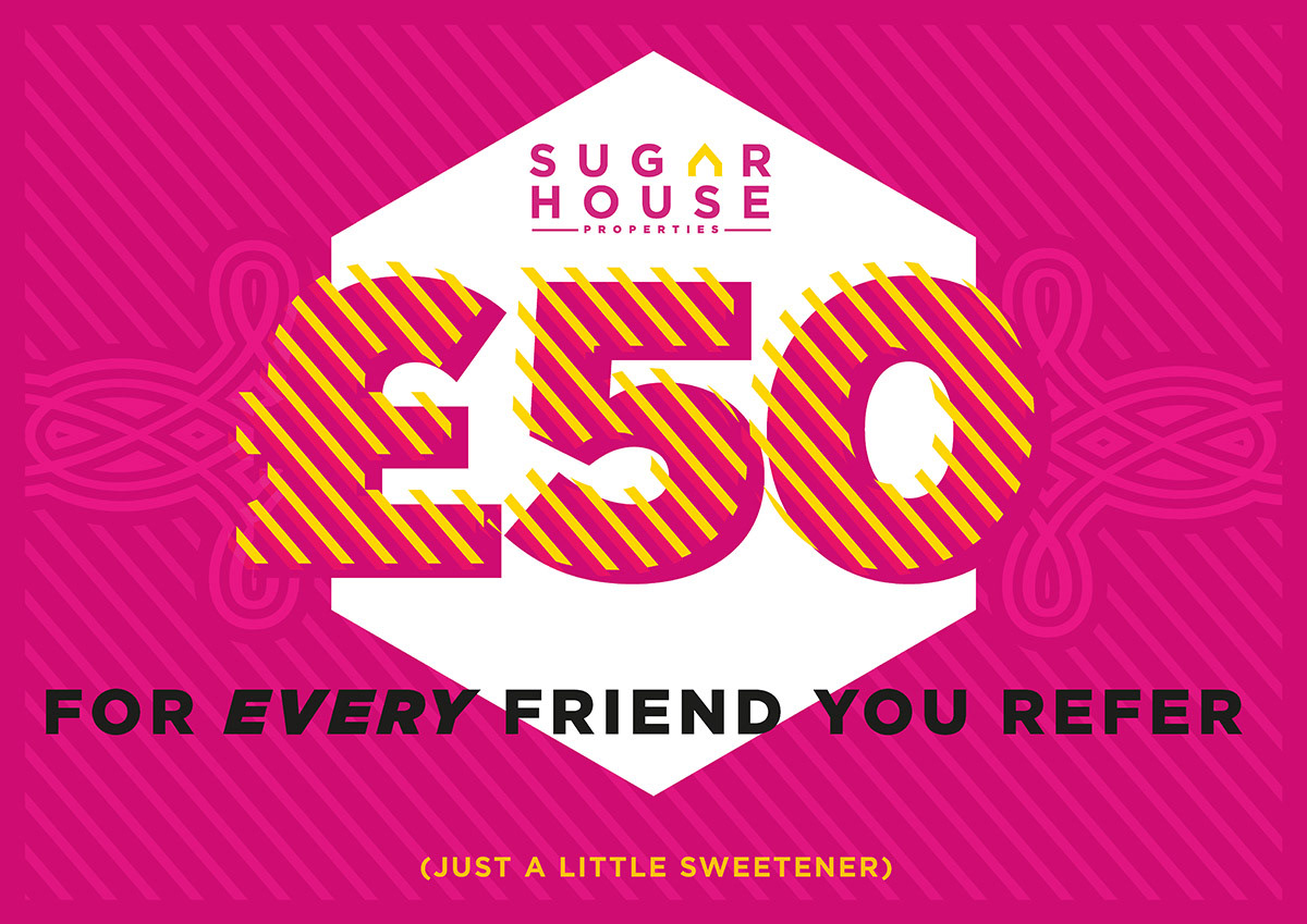
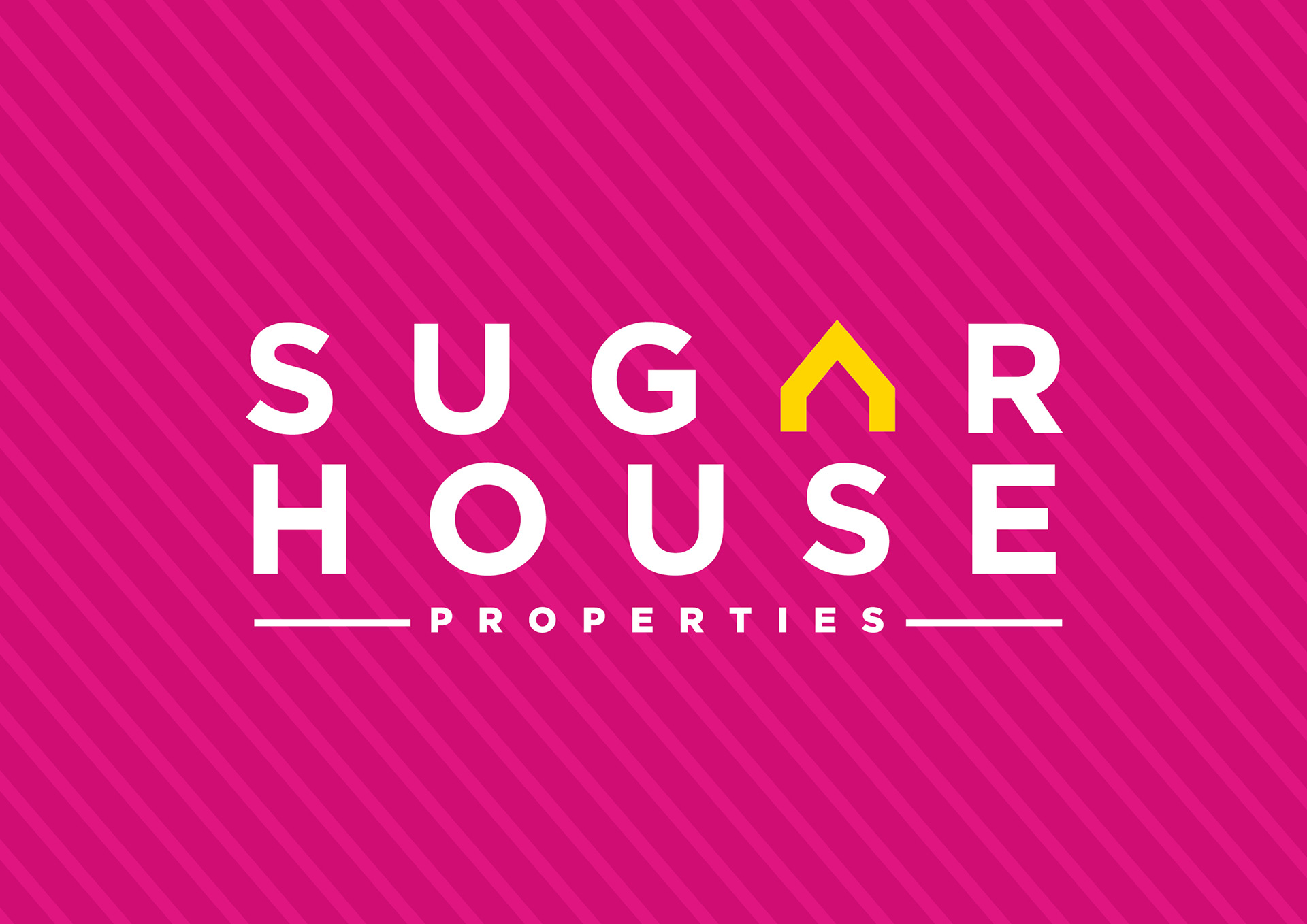
Sugarhouse wanted to keep their distinctive pink - so new assets would sit well with existing elements. We decided to keep the tenants (mainly students) branding primarily pink, while introducing other vibrant colours - along with graphics with a nod to certain iconic sweets...
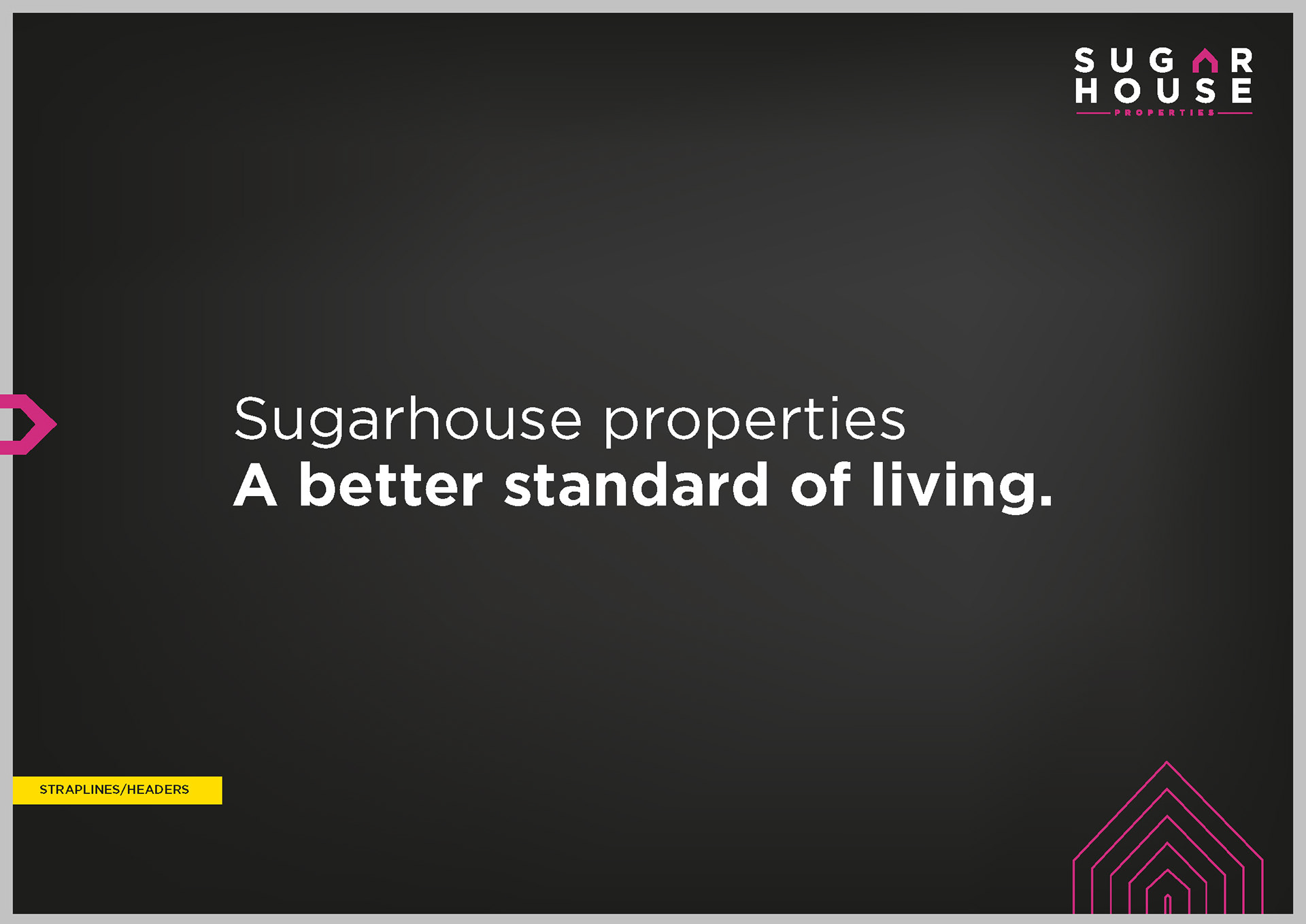
We introduced a reversed out pink on black version, with lighter typography and more sophisticated feel for the landlord branding.
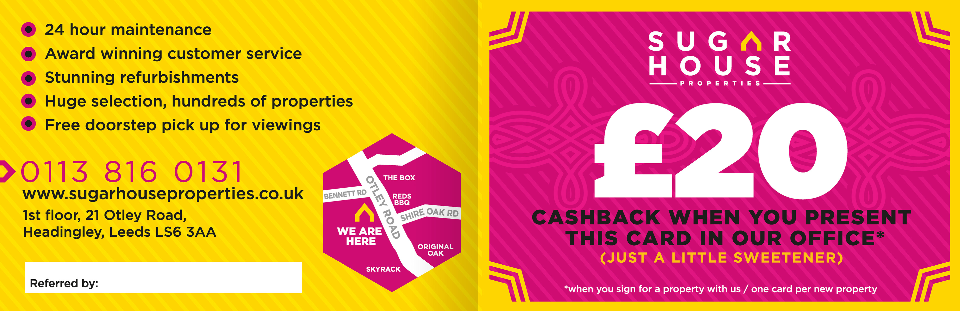
We produced a whole range of marketing materials (including copy) - from brochures, ads and web banners to large-scale billboards, bus shelters and phone booths.


Landlord branding/brochure